A Bootstrap 5 extension to create input spinner elements for number input. Zero dependencies other than Bootstrap 5 — no jQuery required since v5.0.0.
Unofficial third-party component —
bootstrap-input-spinneris maintained by shaack.com and is not affiliated with or endorsed by the Bootstrap team.
Note: bootstrap-input-spinner is now an ES6 module. The legacy ES5 version has been removed; if you still need it, pin to npm
3.x. If you still need jQuery integration, pin to4.x.
The current version is compatible with Bootstrap 5. A Bootstrap 4 compatible version lives on the bootstrap4-compatible branch. npm package versions 3.x, 4.x and 5.x are Bootstrap 5 compatible; 2.x is Bootstrap 4 compatible.
The Bootstrap InputSpinner
- is mobile friendly and responsive,
- automatically changes the value when holding a button,
- has internationalized number formatting,
- allows setting a prefix or a suffix text in the input,
- dynamically handles changing attribute values like
disabledorclass, - supports templates and custom editors,
- dispatches
changeandinputevents on value change like the native element, and - works without extra css, only Bootstrap 5 is needed.
Current version, Bootstrap 5 compatible
npm install bootstrap-input-spinnerBootstrap 4 compatible version
npm install bootstrap-input-spinner@2.2.0Or just download the GitHub repository and import src/InputSpinner.js as an ES module.
Create the element in HTML. The attributes are compatible to the native input[type="number"] element.
<input type="number" value="50" min="0" max="100" step="10"/><script type="module">
import {InputSpinner} from "./src/InputSpinner.js"
const inputSpinnerElements = document.querySelectorAll("input[type='number']")
for (const inputSpinnerElement of inputSpinnerElements) {
new InputSpinner(inputSpinnerElement)
}
</script>That's it. No extra css needed, just Bootstrap 5.
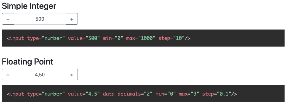
<input type="number" value="4.5" min="0" max="9" step="0.1" data-decimals="2" data-suffix="°C"/>Use these attributes to configure the behaviour
value// starting value on element creationmin// minimum value when steppingmax// maximum value when steppingstep// step sizeinputmode// the "inputmode" of the input, defaults to "decimal" (shows decimal keyboard on touch devices)data-decimals// shown decimal placesdata-digit-grouping// "false" to disable grouping (thousands separator), default is "true"data-prefix// show a prefix text in the input elementdata-suffix// show a suffix text in the input element
The InputSpinner also handles the standard input attributes required, disabled, readonly and placeholder.
Instantiate the InputSpinner class on any <input type="number"> element. You may provide additional configuration
in an object as a second parameter.
import {InputSpinner} from "bootstrap-input-spinner/src/InputSpinner.js"

new InputSpinner(element, config)The default configuration is
const props = {
decrementButton: "<strong>−</strong>", // button text
incrementButton: "<strong>+</strong>", // ..
groupClass: "", // css class of the resulting input-group
buttonsClass: "btn-outline-secondary",
buttonsWidth: "2.5rem",
textAlign: "center", // alignment of the entered number
autoDelay: 500, // ms threshold before auto value change
autoInterval: 50, // speed of auto value change, set to `undefined` to disable auto-change
buttonsOnly: false, // set this `true` to disable the possibility to enter or paste the number via keyboard
keyboardStepping: true, // set this to `false` to disallow the use of the up and down arrow keys to step
mouseWheel: false, // set to `true` to step the value on mouse wheel when the input is focused
locale: navigator.language, // the locale, per default detected automatically from the browser
editor: I18nEditor, // the editor (parsing and rendering of the input)
template: // the template of the input
'<div class="input-group ${groupClass}">' +
'<button style="min-width: ${buttonsWidth}" class="btn btn-decrement ${buttonsClass} btn-minus" type="button">${decrementButton}</button>' +
'<input type="text" inputmode="decimal" style="text-align: ${textAlign}" class="form-control form-control-text-input"/>' +
'<button style="min-width: ${buttonsWidth}" class="btn btn-increment ${buttonsClass} btn-plus" type="button">${incrementButton}</button>' +
'</div>'
}HTML of the texts inside the buttons.
Additional css class for the input-group of the rendered Bootstrap input.
The css class of the buttons. Use it to style the increment and decrement buttons as
described in the Bootstrap 5 button docs. For example
buttonsClass: "btn-primary" or "btn-success".
The width of the increment and decrement buttons.
The text alignment inside the <input>.
The delay in ms after which the input automatically changes the value, when holding the increment or decrement button.
Speed of the value change when holding the button in ms. A lower value makes it faster.
In buttonsOnly mode (set true) no direct text input is allowed, the text-input gets the attribute readonly, but
the plus and minus buttons still allow to change the value.
In keyboardStepping mode (set true) allows the use of the up/down arrow keys to increase/decrease the number by the
step.
Off by default, matching modern browsers which no longer wheel-step native <input type="number"> elements. Set to
true to enable mouse-wheel stepping. The wheel listener is only attached while the input has focus, so an unfocused
spinner never hijacks page scroll. Scroll up increases the value, scroll down decreases it.
Used to format the number in the UI. Detected automatically from the user's browser, can be set to "de", "en",… or " de_DE", "en_GB",….
An Editor defines how the input is parsed and rendered. The default editor is the internal I18nEditor, which
parses and renders an internationalized number. Additional editors live in src/custom-editors.js and are available
as named ES exports:
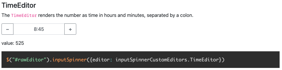
import {RawEditor, TimeEditor} from "bootstrap-input-spinner/src/custom-editors.js"

new InputSpinner(element, {editor: TimeEditor})
An Editor must implement two functions: parse(customFormat) to turn the input string into a number, and
render(number) to format the number back for display.
The simplest custom Editor is the RawEditor, which renders and parses the value without any changes, like a native
number input. It looks like this:
export const RawEditor = function (props, element) {
    this.parse = function (customFormat) {
        // parse nothing
        return customFormat
    }
    this.render = function (number) {
        // render raw
        return number
    }
}
props is the configuration of the spinner and element is the original HTML element. You can use these values for the
configuration of the Editor, like in I18nEditor, which uses props for the language and element for the attributes.
The TimeEditor renders and parses the number to time in hours and minutes, separated by a colon.
To modify the look completely, you can use the template parameter. There is an example about this on the Demo Page.
Read via element.value, write via element.setValue(newValue):
const currentValue = element.value       // read
element.setValue(newValue)                // write
Writing directly with
element.value = 5bypasses the editor rendering, so always usesetValueto update the spinner value programmatically.
The attributes
min, max, step, decimals, placeholder, required, disabled, readonly and class
are handled dynamically. The class attribute value is dynamically copied to the input element.
If the original elements class is set to form-control-sm of form-control-lg the class of the resulting input-group
is dynamically set to input-group-sm or input-group-lg.
The InputSpinner dispatches native input and change events on the original element, just like a native number input.
element.addEventListener("change", function (event) {
    const newValue = event.target.value
})Removes the InputSpinner and shows the original input element.
element.destroyInputSpinner()I don't provide a minified version because I think it should be up to the using programmer to create minified versions, with all the used script sources concatenated to one file.
But, if you want it, it is easy to create your minified version with uglify: https://www.npmjs.com/package/uglify-js
Just install uglify
npm install uglify-js -gand then in the src folder
uglifyjs InputSpinner.js --compress --mangle > InputSpinner.min.jsViolà! :)
There is a Teevi based browser test suite under test/. Serve the repo with any
static server and open test/index.html in a browser to run it:
npx http-server -p 8080
# then open http://localhost:8080/test/The spinner works in all modern browsers that support ES modules.
Find more high quality modules from shaack.com on our projects page.