Simple and customizable expandable card widget, based on the Bernardi23 great project: Here
Inside a Scaffold body, use the ExpandableCard widget, which requires two main attributes to be set:
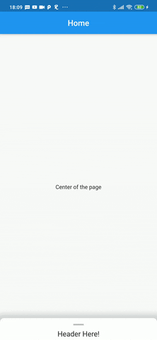
- page: The widget tree shown behind the expandable card
- cardBody: List of widgets shown inside the card, below the handle and the header.
Other ExpandableCard attributes:
Widget header: The header widget is displayed over a divider, between the handle and the cardBody. It's tipically a stylized text that will remain visible when the card is at it's minimum size.EdgeInsetsGeometry padding: The padding inside the card itself, default value isEdgeInsets.only(top: 4, left: 16, right: 16)double minHeight: The size of the card when it's collapsed. Default value is140.0double maxHeight: The size of the card when it's expanded. Default value is500.0bool hasShadow: Weather the card has a box shadow or not. Default value istrueColor backgroundColor: Background color of the card. Default value isColors.whitedouble cornerRadius: The radius of both top corners of the card. Default value is10.0, to have a squared card, simply set to0.0bool hasHandle: Weather the card has a top handle, witch is anIconby default.Color handleColor:The color of the handle Icon, the default value isColors.black26IconData handle:The IconData to be displayed as a handle. The default Icon isIcons.remove
- Automatically set the
minHeightattribute based on the header widget total height, so the header is always visible by default. - Expand the card to it's full size with a simple tap on the header or handle.
- Enable scrolling inside the
cardBody