FormBuilderMultiDropdown is a Flutter widget that allows users to select one or multiple items from a dropdown menu while fully integrating with the flutter_form_builder ecosystem.
It is built on top of the powerful multi_dropdown package and redesigned to work seamlessly with FormBuilderField.
- ✅ Fully compatible with
flutter_form_builder - ✅ Single select & multi select modes
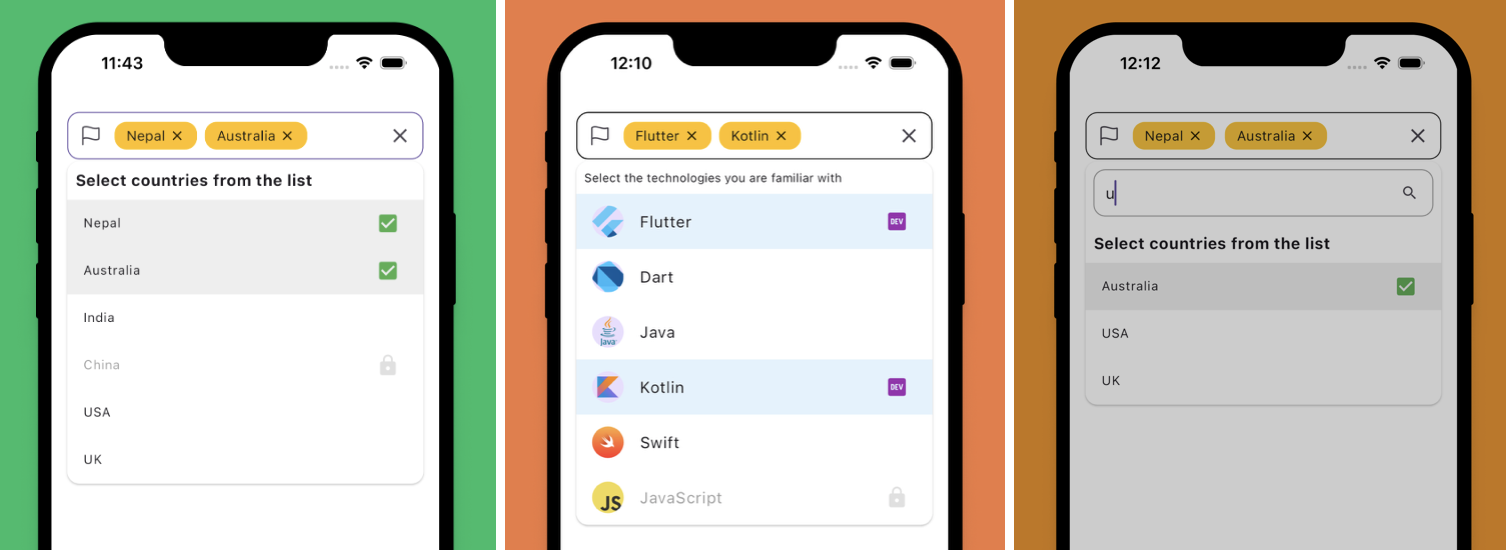
- ✅ Searchable dropdown
- ✅ Async data loading
- ✅ Validation support
- ✅ Custom item builder
- ✅ Custom selected item builder
- ✅ Controller support
- ✅ Chip customization
- ✅ Dropdown decoration customization
- ✅ Auto expand direction (
up,down,auto) - ✅ Smooth open/close animations
- ✅ Overlay-based dropdown
- ✅ Supports large datasets
This package is designed to work with:
flutter_form_buildermulti_dropdown
Add dependencies to your pubspec.yaml:
dependencies:
  flutter_form_builder: ^10.0.1
  form_builder_multi_dropdown: latest
Then run:
flutter pub getFormBuilderMultiDropdown fully supports custom object models.
import 'package:flutter/material.dart';
import 'package:flutter_form_builder/flutter_form_builder.dart';
import 'package:form_builder_multi_dropdown/form_builder_multi_dropdown.dart';

class ProgrammingLanguage {

  final int id;
  final String name;
  final String creator;

  ProgrammingLanguage({
    required this.id,
    required this.name,
    required this.creator,
  });
}

class ExamplePage extends StatelessWidget {

  ExamplePage({super.key});

  final _formKey = GlobalKey<FormBuilderState>();

  final languages = [

    ProgrammingLanguage(
      id: 1,
      name: 'Dart',
      creator: 'Google',
    ),

    ProgrammingLanguage(
      id: 2,
      name: 'Kotlin',
      creator: 'JetBrains',
    ),

    ProgrammingLanguage(
      id: 3,
      name: 'Swift',
      creator: 'Apple',
    ),

    ProgrammingLanguage(
      id: 4,
      name: 'TypeScript',
      creator: 'Microsoft',
    ),
  ];

  @override
  Widget build(BuildContext context) {

    return Scaffold(

      appBar: AppBar(
        title: const Text('FormBuilderMultiDropdown Example'),
      ),

      body: Padding(
        padding: const EdgeInsets.all(16),

        child: FormBuilder(

          key: _formKey,

          child: Column(

            children: [

              FormBuilderMultiDropdown<ProgrammingLanguage>(

                name: 'languages',

                items: languages,

                searchEnabled: true,

                getItemText: (item) => item.name,

                fieldDecoration: const FieldDecoration(
                  labelText: 'Programming Languages',
                ),

                validator: (values) {

                  if (values == null || values.isEmpty) {
                    return 'Please select at least one language';
                  }

                  return null;
                },

                onSelectionChange: (selectedItems) {

                  debugPrint(
                    selectedItems
                        .map((e) => e.name)
                        .join(', '),
                  );
                },
              ),

              const SizedBox(height: 16),

              ElevatedButton(

                onPressed: () {

                  final isValid =
                      _formKey.currentState?.saveAndValidate() ?? false;

                  if (isValid) {

                    final values =
                        _formKey.currentState?.value;

                    debugPrint(values.toString());
                  }
                },

                child: const Text('Submit'),
              ),
            ],
          ),
        ),
      ),
    );
  }
}Use singleSelect: true to allow only one selected item.
FormBuilderMultiDropdown<String>(
  name: 'country',
  items: countries,
  singleSelect: true,
  getItemText: (item) => item,
)FormBuilderMultiDropdown<String>(
name: 'skills',
items: items,
searchEnabled: true,
getItemText: (item) => item,
)FormBuilderMultiDropdown<String>(
name: 'skills',
items: items,
getItemText: (item) => item,
validator: (value) {
if (value == null || value.isEmpty) {
return 'Please select at least one item';
}
return null;
},
)FormBuilderMultiDropdown<ProgrammingLanguage>(
name: 'languages',
items: languages,
getItemText: (item) => item.name,
itemBuilder: (item, index, onTap) {
final language = item.value;
return ListTile(
leading: CircleAvatar(
child: Text(language.name[0]),
),
title: Text(language.name),
subtitle: Text(
'Created by ${language.creator}',
),
onTap: onTap,
);
},
)FormBuilderMultiDropdown<String>(
name: 'skills',
items: items,
getItemText: (item) => item,
fieldDecoration: FieldDecoration(
labelText: 'Skills',
borderRadius: 12,
),
)chipDecoration: ChipDecoration(
backgroundColor: Colors.blue.shade100,
spacing: 8,
runSpacing: 8,
),dropdownDecoration: DropdownDecoration(
maxHeight: 300,
borderRadius: BorderRadius.circular(12),
expandDirection: ExpandDirection.auto,
),You can control the dropdown programmatically using MultiSelectController.
final controller = MultiSelectController<String>();FormBuilderMultiDropdown<String>(
name: 'skills',
controller: controller,
items: items,
getItemText: (item) => item,
)Use future to load data asynchronously.
FormBuilderMultiDropdown<User>(
  name: 'users',

  items: const [],

  future: (query) async {

    await Future.delayed(
      const Duration(milliseconds: 500),
    );

    return users;
  },

  getItemText: (user) => user.name,
)FormBuilderMultiDropdown<User>(
name: 'users',
items: users,
getItemText: (user) => user.name,
itemBuilder: (item, index, onTap) {
return ListTile(
title: Text(item.label),
subtitle: Text(item.value.email),
onTap: onTap,
);
},
)FormBuilderMultiDropdown<String>(
name: 'skills',
items: items,
getItemText: (item) => item,
onSelectionChange: (selectedItems) {
debugPrint(selectedItems.toString());
},
)This package supports many advanced capabilities inherited from the latest multi_dropdown core:
- Auto dropdown expansion direction
- Overlay-based rendering
- Smooth animations
- Search filtering
- Programmatic control
- Dynamic item updates
- Accessibility support
- Large dataset handling
getItemTextis required to convert your object into display text.- Fully generic type support (
FormBuilderMultiDropdown<T>) - Works seamlessly with custom object models
- Type-safe selections with full IDE autocomplete support
- The widget integrates directly into
FormBuilder.
This package is inspired by and built upon:
and redesigned for:
MIT License