Mobile-first SVG chart library for React Native, Expo, and React Native Web

This package is in beta. The core functionality works, but the library is under active development.
- ✅ 24 chart types implemented and working
- ✅ TypeScript support with full type definitions
- ✅ Responsive font sizing
- ✅ Complete examples and demos available in
examples/basic-demo/ ⚠️ Limited testing coverage⚠️ APIs may change in future versions (beta release)⚠️ Some widgets may show NaN issues with edge case data (showing stable ones in examples)
Stable Widgets: KPI, Gauge, LineChart, BarChart, AreaChart, PieChart, Sparkline, Progress
Beta Widgets: Other widgets are functional but may have NaN display issues with certain data
Installation:
npm install react-native-metrify@beta
# or
yarn add react-native-metrify@beta
Latest: v0.1.0-beta.4 - Critical crash fixes for NaN values
Feedback and contributions welcome!
A comprehensive, performance-focused chart library built specifically for React Native. Features 24+ chart types, SVG-based rendering, theme support, and smooth animations.
- 🎨 24+ Chart Types - KPI, Gauge, Line, Bar, Pie, Area, Scatter, Heatmap, and more
- 📱 Mobile-First - Optimized for small screens and touch interactions
- ⚡ High Performance - Element-level animations on UI thread (60 FPS)
- 🎭 Theme Support - Built-in light/dark themes with customization
- 📦 Zero Config - Sensible defaults, minimal API surface
- 🔧 TypeScript - Full type definitions included
- 🌐 Cross-Platform - Works on iOS, Android, and Web (React Native Web)
- 🎯 Expo Compatible - Works in Expo Go and managed workflow
npm install react-native-metrify@betaThis library requires the following peer dependencies:
npm install react-native-svg react-native-reanimatedFor Expo projects, these are typically already installed. For bare React Native:
# Install peer dependencies
npm install react-native-svg react-native-reanimated

# iOS only - install pods
cd ios && pod installimport { ThemeProvider } from 'react-native-metrify';
export default function App() {
return (
<ThemeProvider>
{/* Your app content */}
</ThemeProvider>
);
}import { LineChart, AreaChart, BarChart } from 'react-native-metrify';
import { View } from 'react-native';
// Your data - just a simple array of objects!
const data = [
{ name: 'Jan', sales: 4000, expenses: 2400 },
{ name: 'Feb', sales: 3000, expenses: 1398 },
{ name: 'Mar', sales: 2000, expenses: 9800 },
{ name: 'Apr', sales: 2780, expenses: 3908 },
{ name: 'May', sales: 1890, expenses: 4800 },
{ name: 'Jun', sales: 2390, expenses: 3800 },
];
export default function Dashboard() {
return (
<View>
{/* LineChart - Just specify data and keys! */}
<LineChart
data={data}
xKey="name"
dataKeys={['sales', 'expenses']}
colors={['#82ca9d', '#ff7c7c']}
labels={['Sales', 'Expenses']}
width={350}
height={250}
showGrid
showLegend
/>
{/* LineChart as Area Chart - Just add filled prop! */}
<LineChart
data={data}
xKey="name"
dataKeys={['revenue']}
colors={['#8884d8']}
width={350}
height={250}
filled={true} // Makes it an area chart!
showGradient={true} // Beautiful gradient fill
/>
{/* BarChart - Single value per item */}
<BarChart
data={data}
xKey="name"
dataKey="sales"
width={350}
height={250}
showValues
/>
</View>
);
}For more control, you can still use the original API:
import { KPI, LineChart, Gauge } from 'react-native-metrify';
import { View } from 'react-native';

export default function Dashboard() {
  return (
    <View>
      <KPI
        data={{
          value: 1234,
          label: 'Total Sales',
          delta: 12.5,
          trend: 'up',
          format: 'currency',
          currency: 'USD',
        }}
        width={300}
        height={120}
      />

      <LineChart
        data={{
          series: [{
            data: [
              { x: 0, y: 10 },
              { x: 1, y: 25 },
              { x: 2, y: 15 },
              { x: 3, y: 40 },
              { x: 4, y: 30 },
              { x: 5, y: 55 },
              { x: 6, y: 45 },
            ],
            color: '#007AFF',
          }],
        }}
        width={300}
        height={200}
      />

      <Gauge
        data={{
          value: 75,
          max: 100,
          label: 'Progress',
          unit: '%',
        }}
        width={200}
        height={200}
        startAngle={-120}
        endAngle={120}
      />
    </View>
  );
}All widgets include beautiful, element-level animations powered by react-native-reanimated:
// Animations enabled by default
<Gauge
  data={{ value: 75, max: 100, label: 'Progress' }}
  animated={true}  // Arc sweeps smoothly from 0° to 75°
/>

<KPI
  data={{ value: 1234, label: 'Revenue', format: 'currency' }}
  animated={true}  // Numbers count up smoothly
/>

<BarChart
  data={salesData}
  xKey="month"
  dataKey="sales"
  animated={true}  // Bars grow from baseline with stagger
/>

<LineChart
  data={trendData}
  xKey="date"
  dataKeys={['revenue', 'profit']}
  animated={true}  // Lines draw across the chart
/>

<RadarChart
  data={radarData}
  animated={true}  // Polygon draws around perimeter
/>

<StackedBarChart
  data={stackedData}
  animated={true}  // Stacked segments grow together
/>All 24 widgets have element-level animations:
- 📊 Bar Growth (7 widgets) - Bars grow from 0 to full height with stagger
- ✏️ Path Drawing (8 widgets) - Lines/arcs draw using stroke animation
- ⭕ Scale/Pop (3 widgets) - Elements scale from center outward
- 🎬 Element Stagger (8 widgets) - Items appear one by one
Performance:
- ⚡ 60 FPS on UI thread (no JS thread blocking)
- 🎯 Dynamic animations based on actual data
- 🔄 Calculated perimeter/length for stroke animations
- 🎨 Customizable duration and easing
Disable animations anytime with animated={false}.
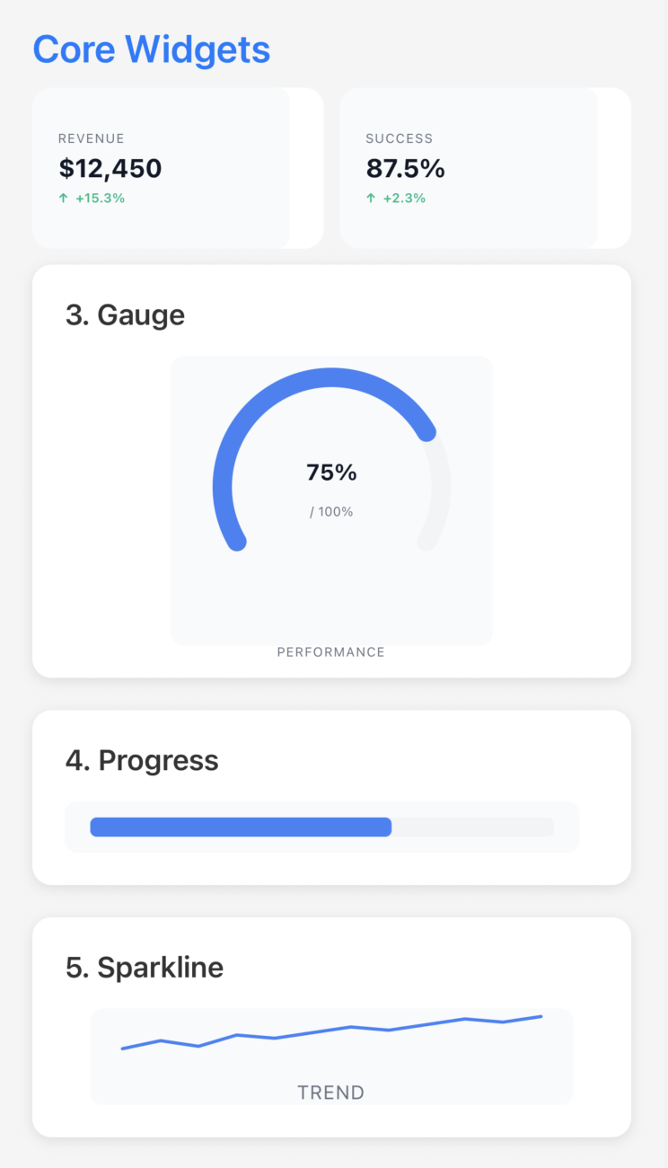 Core Widgets KPI • Gauge • Progress • Sparkline |
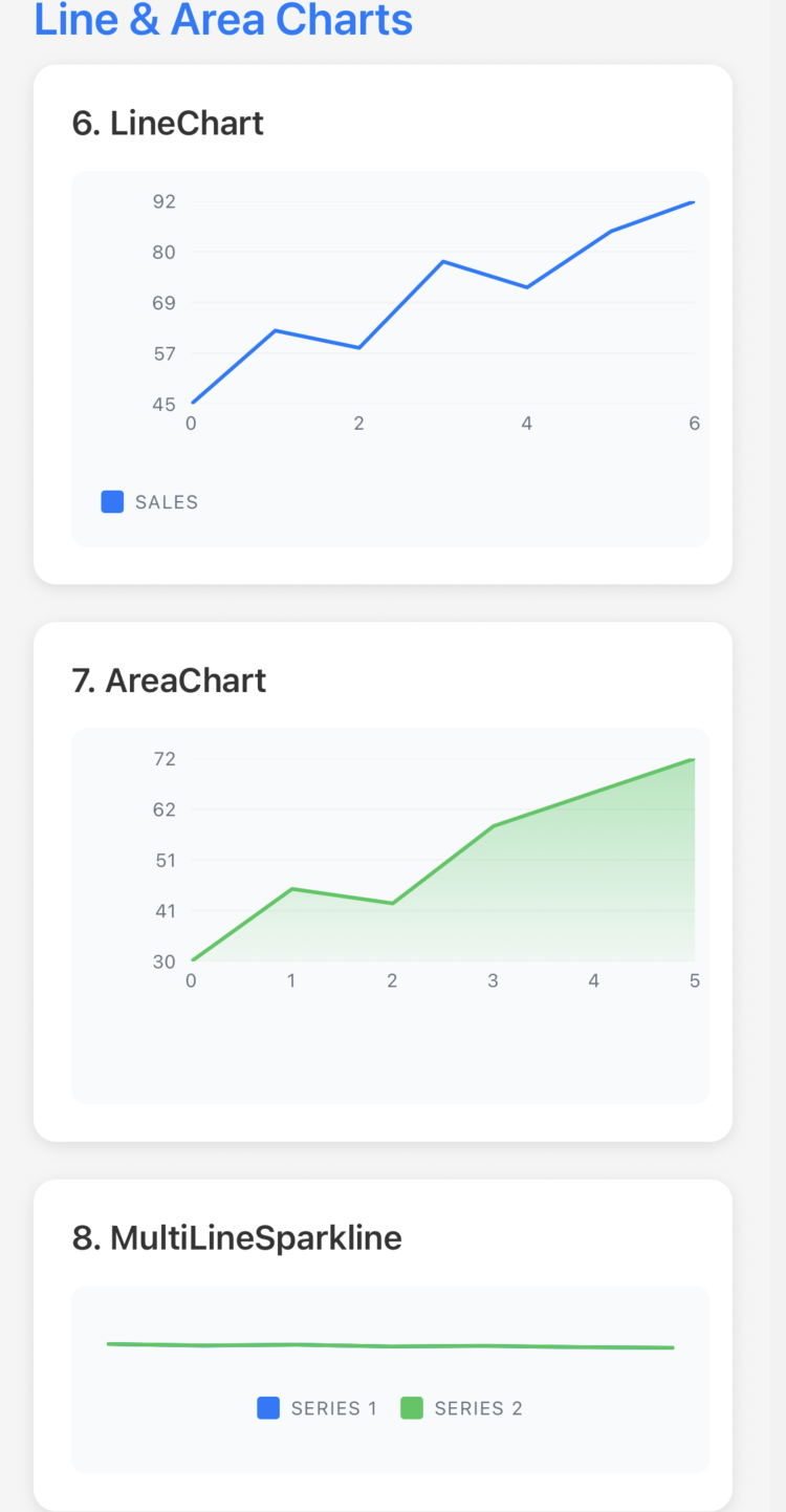 Line & Area Charts LineChart • AreaChart • MultiLineSparkline |
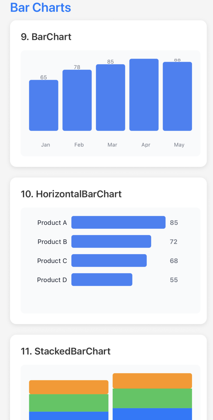 Bar Charts BarChart • HorizontalBarChart • StackedBarChart |
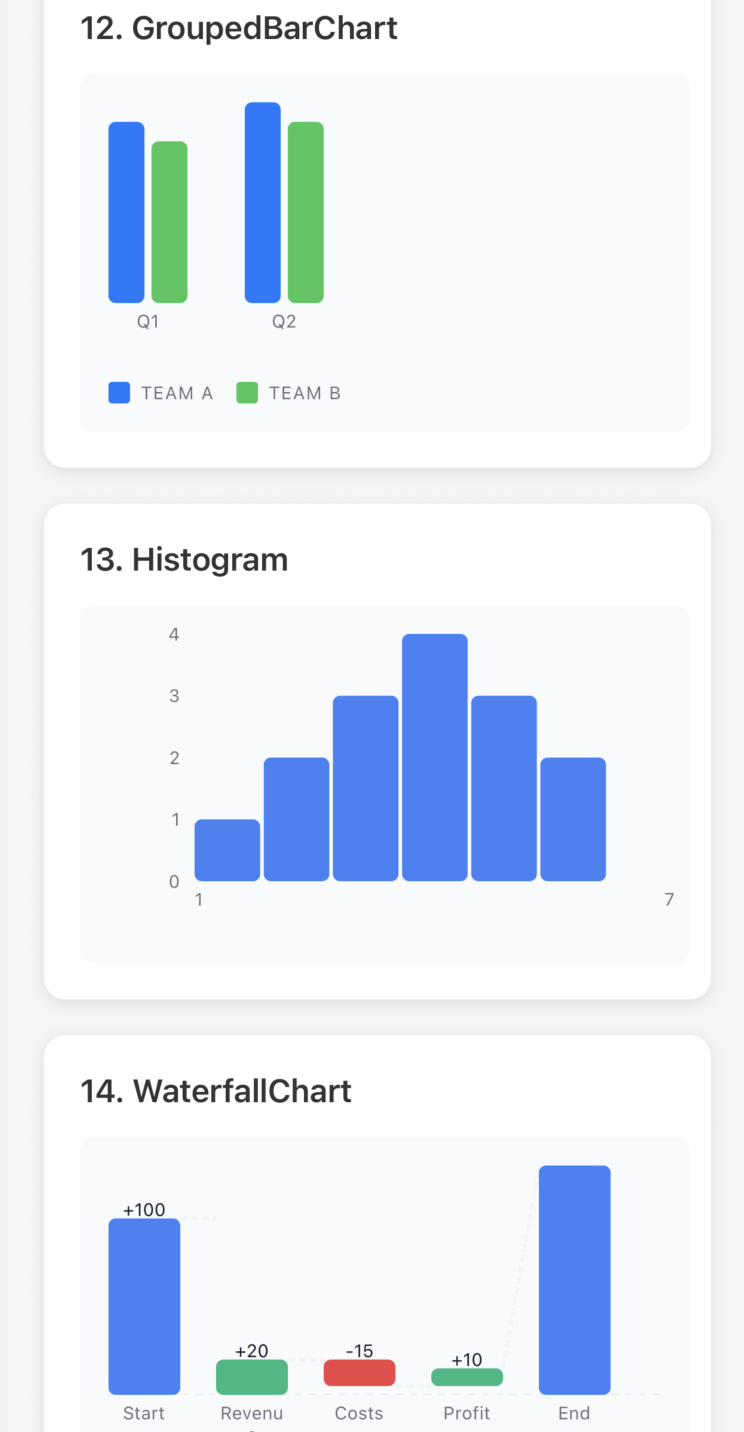 More Bar Charts GroupedBarChart • Histogram • WaterfallChart |
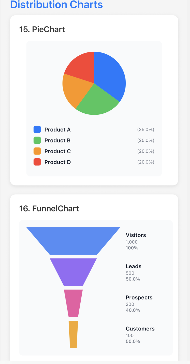 Distribution Charts PieChart • FunnelChart |
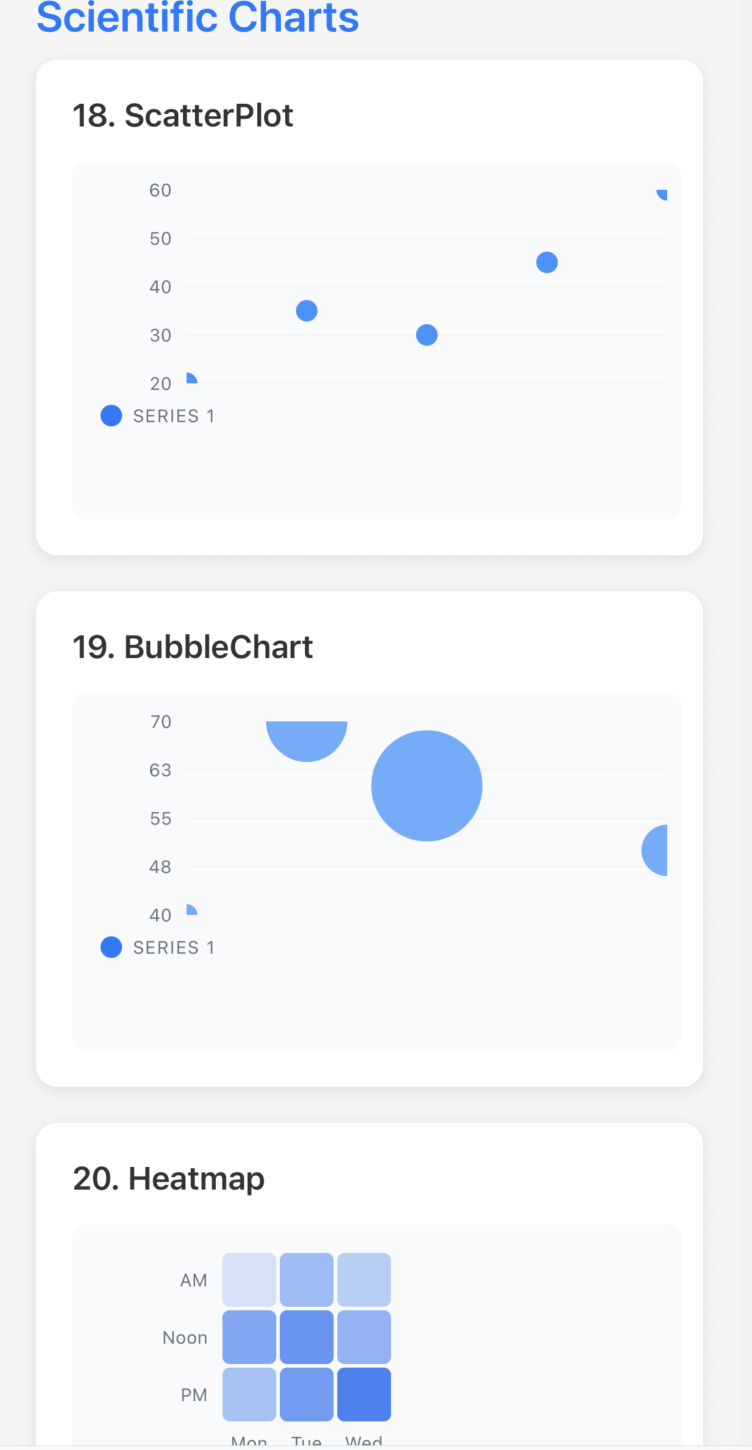 Scientific Charts ScatterPlot • BubbleChart • Heatmap |
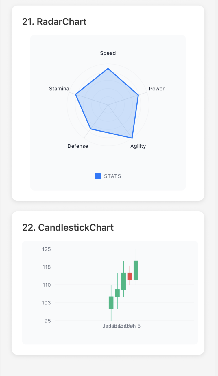 Advanced Charts RadarChart • CandlestickChart |
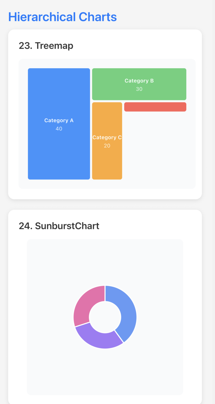 Hierarchical Charts Treemap • SunburstChart |
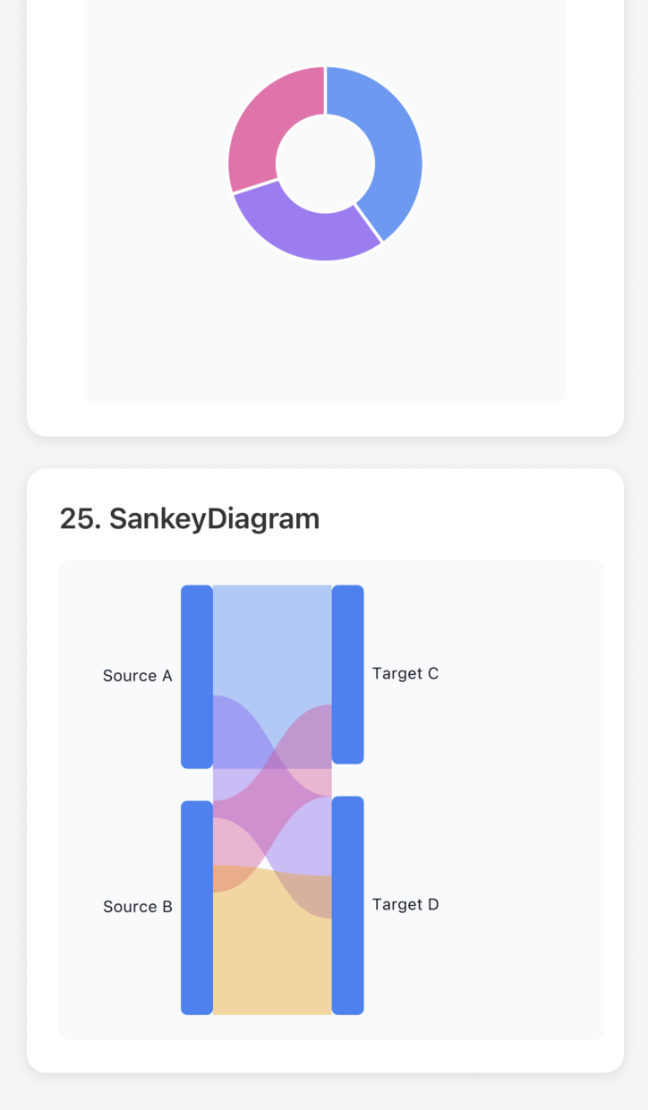 Flow Diagram SankeyDiagram |
|
Bar Charts: BarChart, HorizontalBarChart, StackedBarChart, GroupedBarChart, WaterfallChart, Histogram
Line & Area: LineChart (with area support), MultiLineSparkline, AreaChart (deprecated, use LineChart with filled={true})
Distribution: PieChart, FunnelChart, BoxPlot
Scientific: ScatterPlot, BubbleChart, Heatmap, RadarChart, CandlestickChart
Hierarchical: Treemap, SunburstChart, SankeyDiagram
We've made it super easy to use charts! Inspired by Recharts, you can now pass your data directly without manual transformation.
❌ Old Way (Complex):
// Had to manually transform your data
const chartData = {
  series: [
    {
      data: data.map(d => ({ x: d.month, y: d.sales })),
      color: '#82ca9d',
      label: 'Sales'
    },
    {
      data: data.map(d => ({ x: d.month, y: d.expenses })),
      color: '#ff7c7c',
      label: 'Expenses'
    }
  ]
};

<LineChart data={chartData} width={350} height={250} />
✅ New Way (Simple):
// Just pass your data and specify the keys!
<LineChart
  data={data}
  xKey="month"
  dataKeys={['sales', 'expenses']}
  colors={['#82ca9d', '#ff7c7c']}
  labels={['Sales', 'Expenses']}
  width={350}
  height={250}
/>The Simple API is available for ALL chart types:
Line & Area: LineChart, AreaChart
Bar Charts: BarChart, GroupedBarChart, StackedBarChart, HorizontalBarChart
Pie & Distribution: PieChart, FunnelChart
Scatter: ScatterPlot, BubbleChart
Multi-Axis: RadarChart
Statistical: Heatmap, BoxPlot, Histogram
Financial: WaterfallChart, CandlestickChart
// LineChart - Multiple series
<LineChart data={data} xKey="month" dataKeys={['sales', 'expenses']} />

// LineChart as Area Chart - Just add filled prop
<LineChart data={data} xKey="month" dataKeys={['revenue']} filled={true} showGradient />

// AreaChart still works (deprecated, uses LineChart internally)
<AreaChart data={data} xKey="month" dataKeys={['revenue']} />

// BarChart - Single value
<BarChart data={data} xKey="category" dataKey="revenue" />

// PieChart - Segments
<PieChart data={data} labelKey="category" valueKey="amount" />

// ScatterPlot - X/Y coordinates
<ScatterPlot data={data} xKey="x" yKey="y" />

// RadarChart - Multi-axis comparison
<RadarChart data={data} categoryKey="skill" dataKeys={['you', 'teamAvg']} />

// Heatmap - Grid visualization
<Heatmap data={data} xKey="day" yKey="hour" valueKey="activity" />

// And 15+ more charts!📖 Complete Simple API Reference →
See all chart types with detailed examples in examples/API_REFERENCE.md
✓ 60% less code - No manual data transformation needed
✓ Works with ALL charts - Consistent API across 20+ chart types
✓ Familiar API - Similar to Recharts and other popular charting libraries
✓ Backward compatible - Old API still works perfectly
✓ Automatic colors - Uses a nice default palette if you don't specify colors
✓ TypeScript support - Full type safety with autocomplete
import { ThemeProvider, DefaultTheme, DarkTheme } from 'react-native-metrify';

function App() {
  const [isDark, setIsDark] = useState(false);

  return (
    <ThemeProvider theme={isDark ? DarkTheme : DefaultTheme}>
      {/* Your content */}
    </ThemeProvider>
  );
}import { ThemeProvider, Theme } from 'react-native-metrify';
const customTheme: Theme = {
background: '#ffffff',
text: '#000000',
primary: '#007AFF',
secondary: '#5856D6',
success: '#34C759',
warning: '#FF9500',
error: '#FF3B30',
grid: '#E5E5EA',
// ... more colors
};
<ThemeProvider theme={customTheme}>
{/* Your content */}
</ThemeProvider>All chart components support these common props:
interface BaseWidgetProps {
  width?: number;          // Chart width (default: container width)
  height?: number;         // Chart height (required for most charts)
  style?: ViewStyle;       // Container style
  testID?: string;         // Test identifier
}<KPI
data={{
value: 1234,
label: "Revenue",
trend: 12.5, // Percentage change
format: "currency", // 'number' | 'currency' | 'percentage'
currency: "USD", // Currency code for formatting
precision: 2, // Decimal places
}}
width={200}
/>New in v0.1.0-beta.1: LineChart now supports area charts with the filled prop!
// Regular Line Chart
<LineChart
  data={data}
  xKey="month"
  dataKeys={['sales', 'expenses']}
  width={350}
  height={250}
/>

// Area Chart (filled line chart)
<LineChart
  data={data}
  xKey="month"
  dataKeys={['revenue']}
  width={350}
  height={250}
  filled={true}        // Enable area fill
  showGradient={true}  // Show gradient (optional)
/>

// Legacy API still works
<LineChart
  data={{
    series: [
      {
        data: [
          { x: 0, y: 10 },
          { x: 1, y: 25 },
          { x: 2, y: 15 },
          { x: 3, y: 40 },
          { x: 4, y: 30 },
        ],
        color: "#007AFF",
        label: "Sales",
      },
    ],
  }}
  width={300}
  height={200}
/><Gauge
data={{
value: 75,
max: 100,
label: "Progress",
unit: "%",
}}
width={200}
height={200}
startAngle={-120} // Start angle in degrees
endAngle={120} // End angle in degrees
showValue={true}
showLabel={true}
/>Text automatically scales based on widget dimensions:
// Small widget - fonts scale down
<KPI
  data={{ value: 1234, label: "Revenue" }}
  width={150}
  height={80}
/>

// Large widget - fonts scale up
<KPI
  data={{ value: 1234, label: "Revenue" }}
  width={600}
  height={200}
/>

// Custom font sizes (disable responsive)
<KPI
  data={{ value: 1234, label: "Revenue" }}
  width={300}
  height={120}
  fontSize={{
    labelSize: 14,
    valueSize: 36,
    secondarySize: 16,
    responsive: false
  }}
/>- Mobile-First: Optimized for small screens and touch interactions
- Performance: UI thread animations with react-native-reanimated for smooth 60 FPS animations
- Type-Safe: Full TypeScript support with inference
- Zero Config: Sensible defaults, minimal API surface
| Platform | Status | Notes |
|---|---|---|
| iOS | ✅ Fully Supported | Requires iOS 13+ |
| Android | ✅ Fully Supported | Requires Android 6.0+ |
| Web | ✅ Supported | Via React Native Web |
| Expo Go | ✅ Supported | Works out of the box |
Contributions are welcome! Please:
- Open an issue to discuss changes
- Fork the repo and create a feature branch
- Submit a PR with clear description
MIT © Krishna Kumar
Check out the examples directory for complete working examples:
- AllWidgetsDashboard.tsx - All 24 widgets in one scrollable file
- KPIExample.tsx - 7 KPI variations
- GaugeExample.tsx - 6 Gauge variations
- DashboardExample.tsx - Real-world dashboard
- API_REFERENCE.md - Complete type reference
Copy any example directly into your app and start using it!
Made with ❤️ for the React Native community