-
Notifications
You must be signed in to change notification settings - Fork 0
Expand file tree
/
Copy path02-Regression.qmd
More file actions
297 lines (189 loc) · 13.8 KB
/
02-Regression.qmd
File metadata and controls
297 lines (189 loc) · 13.8 KB
1
2
3
4
5
6
7
8
9
10
11
12
13
14
15
16
17
18
19
20
21
22
23
24
25
26
27
28
29
30
31
32
33
34
35
36
37
38
39
40
41
42
43
44
45
46
47
48
49
50
51
52
53
54
55
56
57
58
59
60
61
62
63
64
65
66
67
68
69
70
71
72
73
74
75
76
77
78
79
80
81
82
83
84
85
86
87
88
89
90
91
92
93
94
95
96
97
98
99
100
101
102
103
104
105
106
107
108
109
110
111
112
113
114
115
116
117
118
119
120
121
122
123
124
125
126
127
128
129
130
131
132
133
134
135
136
137
138
139
140
141
142
143
144
145
146
147
148
149
150
151
152
153
154
155
156
157
158
159
160
161
162
163
164
165
166
167
168
169
170
171
172
173
174
175
176
177
178
179
180
181
182
183
184
185
186
187
188
189
190
191
192
193
194
195
196
197
198
199
200
201
202
203
204
205
206
207
208
209
210
211
212
213
214
215
216
217
218
219
220
221
222
223
224
225
226
227
228
229
230
231
232
233
234
235
236
237
238
239
240
241
242
243
244
245
246
247
248
249
250
251
252
253
254
255
256
257
258
259
260
261
262
263
264
265
266
267
268
269
270
271
272
273
274
275
276
277
278
279
280
281
282
283
284
285
286
287
288
289
290
291
292
293
294
295
296
297
# Regression
*In the second week of class, we will look at linear regression in more depth, and examine the challenge of over-fitting.*
## Linear Regression in depth
Last week, we were exposed to the Linear Regression model. Today we will take it apart and look at it carefully to see how it works and what are the needed assumptions to use this model.
### One predictor
Suppose we just use one predictor, $Age$ to predict our outcome $MeanBloodPressure$.
$$
MeanBloodPressure= \beta_0 + \beta_1 \cdot Age
$$
Our model would look like the following like the red line from our Training data:
```{python}
import pandas as pd
import seaborn as sns
import numpy as np
from sklearn.model_selection import train_test_split
from sklearn.metrics import mean_squared_error
import matplotlib.pyplot as plt
from formulaic import model_matrix
from sklearn import linear_model
import statsmodels.api as sm
nhanes = pd.read_csv("classroom_data/NHANES.csv")
nhanes.drop_duplicates(inplace=True)
nhanes['MeanBloodPressure'] = nhanes['BPDiaAve'] + (nhanes['BPSysAve'] - nhanes['BPDiaAve']) / 3
nhanes_train, nhanes_test = train_test_split(nhanes, test_size=0.2, random_state=42)
y_train, X_train = model_matrix("MeanBloodPressure ~ Age", nhanes_train)
linear_reg = linear_model.LinearRegression()
linear_reg = linear_reg.fit(X_train, y_train)
y_train_predicted = linear_reg.predict(X_train)
plt.clf()
plt.scatter(X_train.Age, y_train, alpha=.2)
plt.plot(X_train.Age, y_train_predicted, color="red")
plt.xlabel('Age')
plt.ylabel('Mean Blood Pressure')
plt.show()
```
This model is formed by making the the line of best fit determined by the minimum of the sum of squared difference between the observed response (in blue points) and predicted response (in red line). Using the terminology from last week, we say that we fit a line where the Mean Squared Error (MSE) is minimized.
Another illustration:
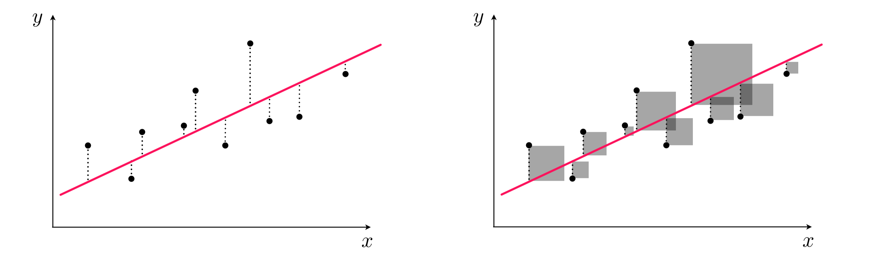{width="800"}
Left panel: difference between response and predicted response (residual). Right panel: squared difference between predicted response and response.
## Assumptions of linear regression
Any model that one uses has some assumptions about the data that allows the model to make good predictions. *Note that there are other types of assumptions if your modeling technique is focused on inference*.
Let's take a look what are the assumptions needed for a sound model, and what we can do to address it not upheld.
### Linearity of responder-predictor relationship
The linear regression model assumes that there is a straight line (linear) relationship between the predictors and the response. It doesn't ask for the straight line relationship to be perfect, but rather on average the cloud of points has a linear shape. If that is not true, then our prediction is going to be less accurate.
We can check this relationship by seeing whether predictor is linear with the predicted response value, but this is cumbersome with multiple predictors. Rather, we typically calculate the **residual**, which is the difference between the response value and the predicted response value (similar to a type of model performance metrics we examined last week). Then, we can make a **residual plot** of the predicted response vs. residual. Ideally, this residual plot should have no pattern - some residuals above 0, some below 0, but no strong trend.
If there's a trend in the data, that means there are non-linear associations between some of the predictors and the response.
```{python}
residual = y_train - y_train_predicted
plot_df = pd.DataFrame({'Age': X_train.Age, 'Predicted_Response': np.ravel(y_train_predicted), 'Residual': np.ravel(residual)})
plt.clf()
ax = sns.regplot(x="Predicted_Response", y="Residual", data=plot_df, lowess=True, scatter_kws={'alpha':0.2}, line_kws={'color':"r"})
plt.show()
```
We see there's a slight curve in our residual plot. We will look at ways to deal with this later in this lecture.
In a model with more predictors, we can dig into more details by making a residual plot of a predictor vs. residual. This is often used to figure out which predictor is contributing to the shape of the predicted response vs. residual plot.
```{python}
plt.clf()
ax = sns.regplot(x="Age", y="Residual", data=plot_df, lowess=True, scatter_kws={'alpha':0.2}, line_kws={'color':"r"})
plt.show()
```
### No Outliers
An **outlier** is an obseravtion for which the response is far from the value predicted response (y-axis). An observation has high **leverage** if it has an unusual predictor value (x-axis). Outliers and high leverage observations arise may arise out of incorrect measurements, among many other causes. When these observations cause significant changes to the regression model, they are called **influential**. They may greatly contribute to the Mean Squared Error, as observations away the majority of the data will have exponentially large residuals.
Some possible solutions:
- We can eyeball for for potential influential points by exploratory data analysis, and see how the model changes if we remove it. We may troubleshoot with the instruments that generated the data in the first place to diagnosis.
- We can detect an influential point via computing the studentized residuals or cook's distance and decide whether it makes sense to remove it.
- We can use a different linear regression method, called Huber loss regression, that allows more tolerance for outliers.
### Predictors are not colinear
**Colinearity** is the situation when two or more predictors are linearly related to each other. If we put collinear predictors into our regression model, they start to serve as redundant information to our model and can degrade predictive performance.
Some possible solutions:
- We can detect collinearity to look at the correlation matrix between predictors. This works well for pairwise correlations.
- When there is a collinear relationship between three or more predictors, pairwise methods will fail. We may consider the Variance Inflation Factor to detect them, but doesn't necessarily recommend which variables to remove.
Suppose that we are consider the predictors of our training set:
```{python}
#some cleanup
obj_columns = nhanes_train.select_dtypes(['object']).columns
nhanes_train[obj_columns] = nhanes_train[obj_columns].apply(lambda x: x.astype('category'))
cat_columns = nhanes_train.select_dtypes(['category']).columns
nhanes_train[cat_columns] = nhanes_train[cat_columns].apply(lambda x: x.cat.codes)
#create correlation matrix
corr_matrix = nhanes_train.corr()
plt.clf()
sns.heatmap(corr_matrix, cmap='coolwarm')
plt.show()
```
Let's look at a pair of predictors up close:
```{python}
plt.clf()
ax = sns.regplot(y="Age", x="Poverty", data=nhanes_train, lowess=True, scatter_kws={'alpha':0.1}, line_kws={'color':"r"})
plt.show()
```
### Number of predictors is less than the number of samples
Sometimes, in machine learning, we have more predictors than the number of samples. This is called a **high dimensional** problem. Our regression method will not work here and we need to find ways to reduce the number of predictors.
We recommend evaluate the assumptions of your linear regression model on the training set before evaluating it on the test set.
## Extensions of the Linear Model
### Polynomial Regression
Let's go back to revisit the non-linearity of responder-predictor relationship. To deal with the slight curve in the residual plot, we can extend our model to accommodate non-linear relationships via **Polynomial Regression**.
Here is what polynomial regression is capable, visually:
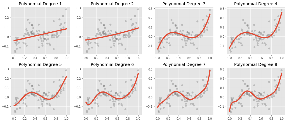{width="700"}
Recall our original equation:
$$
MeanBloodPressure= \beta_0 + \beta_1 \cdot Age
$$ We can include transformed versions of the predictors to have other shapes, such as a quadratic shape:
$$
MeanBloodPressure= \beta_0 + \beta_1 \cdot Age + \beta_2 \cdot Age^2
$$
This is *still* a linear model -- we have added a new predictor that gives us a quadratic shape. We use the [`poly()` function](https://matthewwardrop.github.io/formulaic/latest/guides/splines/#poly) to generate our polynomial predictor.
```{python}
y_train, X_train = model_matrix("MeanBloodPressure ~ poly(Age, degree=2, raw=True)", nhanes_train)
linear_reg = linear_model.LinearRegression()
linear_reg = linear_reg.fit(X_train, y_train)
y_train_predicted = linear_reg.predict(X_train)
plt.clf()
plt.scatter(X_train[X_train.columns[1]], y_train, alpha=.2)
plt.scatter(X_train[X_train.columns[1]], y_train_predicted, color="red")
plt.xlabel('Age')
plt.ylabel('Mean Blood Pressure')
plt.show()
```
Let's look at our Residual Plot:
```{python}
residual = y_train - y_train_predicted
plot_df = pd.DataFrame({'y_train_predicted': np.ravel(y_train_predicted), 'residual': np.ravel(residual)})
plt.clf()
ax = sns.regplot(x="y_train_predicted", y="residual", data=plot_df, lowess=True, scatter_kws={'alpha':0.2}, line_kws={'color':"r"})
plt.show()
```
Okay, looks better! Less of a curved trend in the residual plot.
In general, it is rather unusual to see the polynomial term grow beyond 4, as they become more overly flexible and take on more strange shapes.
## Interactions
Here is another way to extend the Linear Model:
Suppose we think that $BMI$ and $Gender$ may be good predictors of $MeanBloodPressure$:
Let's explore the relationship between $MeanBloodPressure$ and $BMI$ separately for values of $Gender$.
```{python}
plt.clf()
ax = sns.lmplot(y="MeanBloodPressure", x="BMI", hue="Gender", data=nhanes_train, lowess=False, scatter_kws={'alpha':0.1})
ax.set(xlim=(10, 50))
plt.show()
```
The only model we know that relates all of these variables is:
$$
MeanBloodPressure= \beta_0 + \beta_1 \cdot BMI + \beta_2 \cdot Gender
$$
According to our model, the relationship between $BMI$ and $MeanBloodPressure$ is a linear line with slope $\beta_1$, and the additional predictor of $Gender$ will change our prediction by only a constant, $\beta_2$. Visually, that would look like two parallel lines, with $\beta_2$ dictating the distance between parallel lines. However, this plot suggests that our original model isn't quite right: the additional predictor of $Gender$ changes our prediction by more than a constant - it is dependent on $BMI$ also.
When multiple predictors have an synergistic effect on the outcome, their effect on the outcome occurs jointly - this is called an **Interaction**. To incorporate this into our model, we add an interaction term:
$$
MeanBloodPressure= \beta_0 + \beta_1 \cdot BMI + \beta_2 \cdot Gender + \beta_3 \cdot BMI \cdot Gender
$$
Let's see what happens:
```{python}
y_train, X_train = model_matrix("MeanBloodPressure ~ BMI + Gender + BMI*Gender", nhanes_train)
linear_reg = linear_model.LinearRegression()
linear_reg = linear_reg.fit(X_train, y_train)
y_train_predicted = linear_reg.predict(X_train)
plt.clf()
plt.scatter(X_train.BMI, y_train, alpha=.2)
plt.scatter(X_train.BMI, y_train_predicted, color="red")
plt.xlabel('BMI')
plt.ylabel('Mean Blood Pressure')
plt.show()
```
Which creates unique, non-parallel lines depending on the value of $Gender$.
## Appendix: Inference
For this course, we focus on prediction from our machine learning models. These models have an equally important usage in statistical inference. This appendix gives a quick overview of what that is about.
### Population and Sample
The way we formulate machine learning model is based on some fundamental concepts in inferential statistics. We will refresh this quickly in the context of our problem. Recall the following definitions:
**Population:** The entire collection of individual units that a researcher is interested to study. For NHANES, this could be the entire US population.
**Sample:** A smaller collection of individual units that the researcher has selected to study. For NHANES, this could be a random sampling of the US population.
If the concepts of population, sample, estimation, p-value, and confidence interval is new to you, we recommend do a bit of reading here <https://www.nature.com/collections/qghhqm/pointsofsignificance.>
### Parameter inference
Now let's examine the function $f()$'s trained values, which are called **parameters**.
For the Linear Model, the model we first fitted was of the following form:
$$
BloodPressure=\beta_0 + \beta_1 \cdot BMI
$$
which is an equation of a line.
$\beta_0$ is a parameter describing the intercept of the line, and $\beta_1$ is a parameter describing the slope of the line.
Suppose that from fitting the model on the Training Set, $\beta_1=2$. That means increasing $BMI$ by 1 will lead to an increase of $BloodPressure$ by 2. This measures the strength of association between a variable and the outcome.
Let's see this in practice:
```{python}
import statsmodels.api as sm
y, X = model_matrix("MeanBloodPressure ~ BMI", nhanes_train)
X_train, X_test, y_train, y_test = train_test_split(X, y, test_size=0.5, random_state=42)
model = sm.OLS(y_train, X_train).fit()
model.summary()
```
Based on the output, $\beta_0=69$, $\beta_1=.55$. We also see associated standard errors, p-values, and confidence intervals. This is necessarily to report and interpret because we derive these parameters based on a sample of the data (train or test set), so there are statistical uncertainties associated with them. For instance, the 95% confidence interval of true population parameter will fall between (.22, .87). Notice that we used a different package called `statsmodels` instead of `sklearn` to look the model inference.
## Appendix: Feature engineering
## Exercises
Exercises for week 2 can be [found here](https://colab.research.google.com/drive/1woUGP4Ng-zBItT6sqIuogxAn8TOXRyvZ?usp=sharing).