[Bug] No dark overlay on tablet when opening sidebar #39
Description
When opening the sidebar on mobile, the main content is covered by a semi-transparent dark overlay:
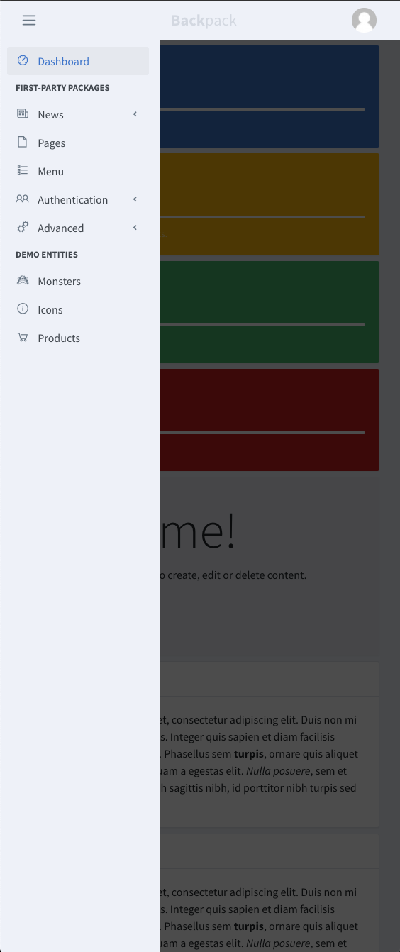
Which makes the menu easy pop out, easy to read, and easy to distinguish from the content if the sidebar is the same color as the content.
However, when viewing from a tablet, despite the fact that we have the same sidebar (aka drawer) functionality, there is no dark overlay:
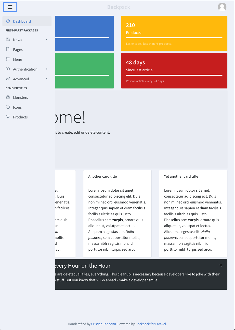
This makes it confusing to use the sidebar menu on tablet. We should use the same dark overlay as on mobile.